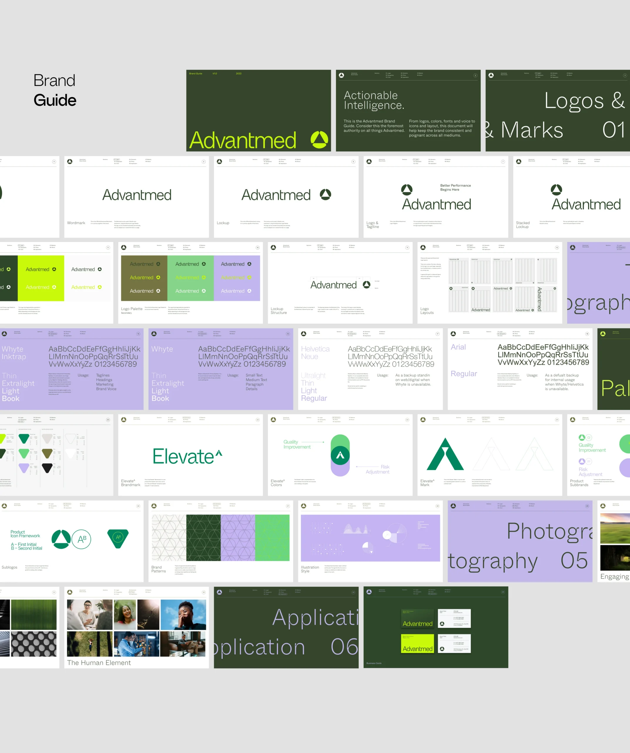
(01)
Project
Overview
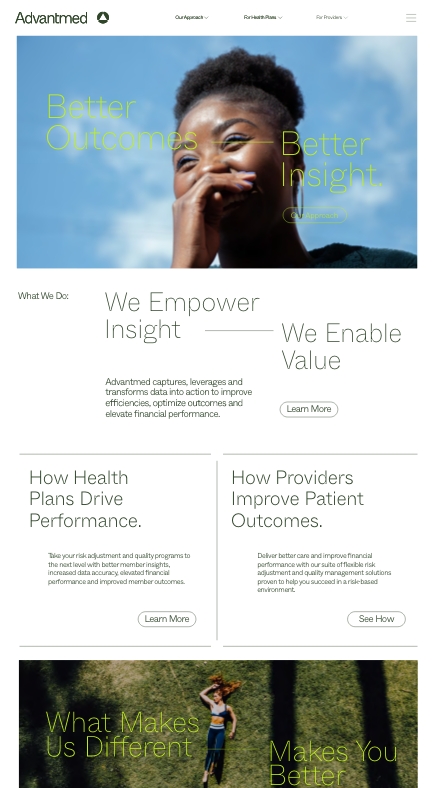
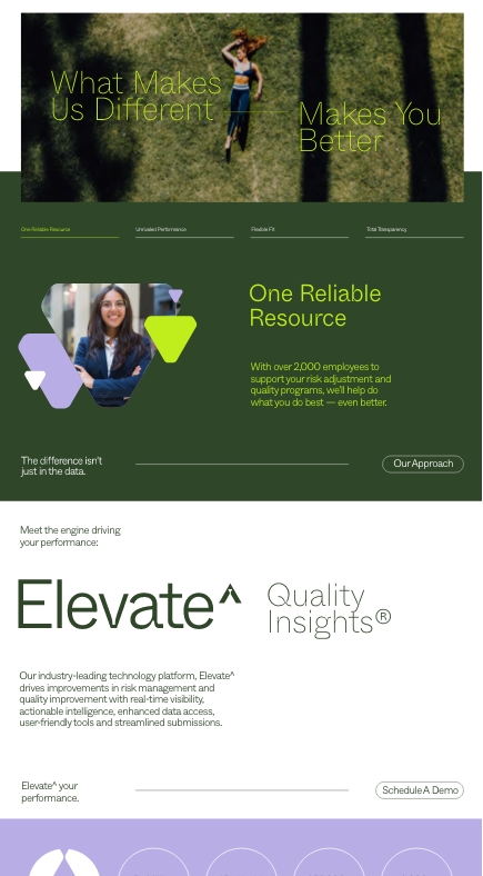
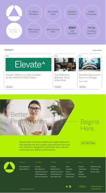
In the highly competitive world of Healthcare SAAS, Advantmed chose to boldly brand the way no one had before and no one is looking back.
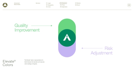
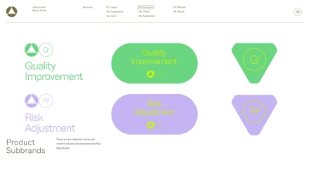
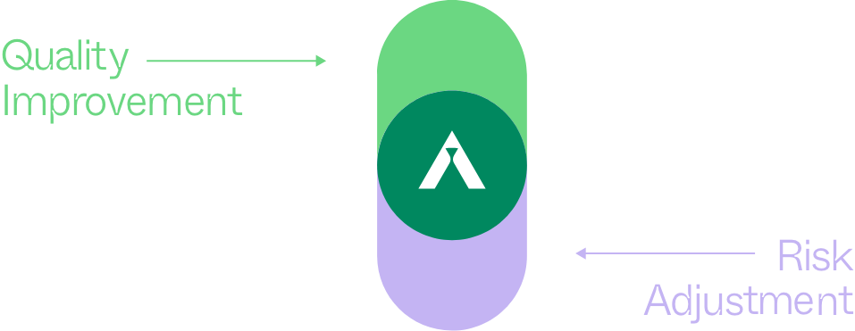
Over 1M providers and 40 health plans—including four out of the top five—trust Advantmed with their risk adjustment and quality improvement programs.
CLIENT: ADVANTMED
SECTOR: HEALTHCARE SAAS
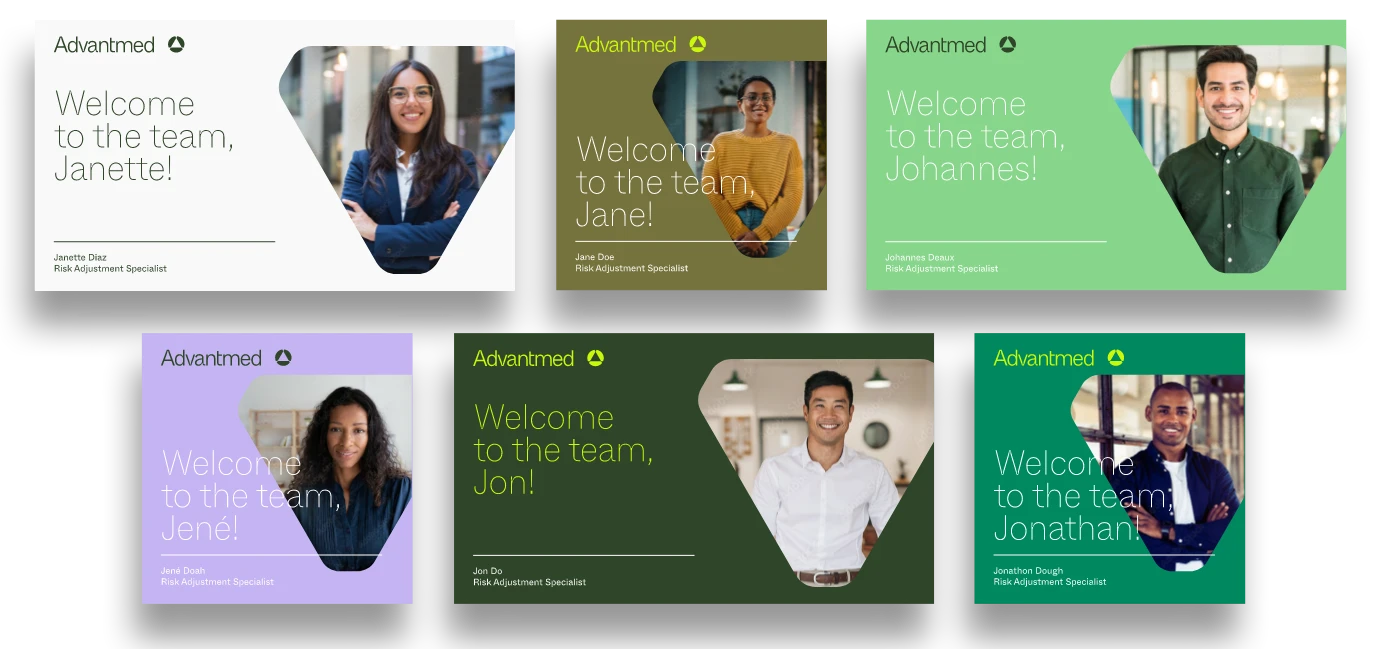
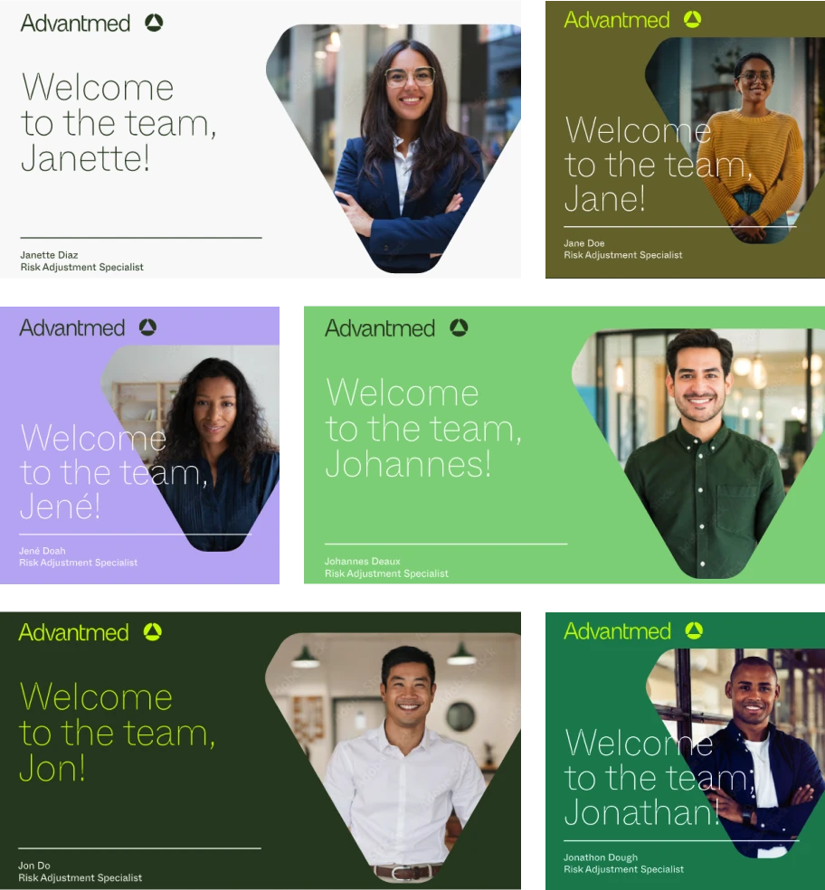

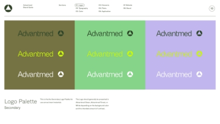
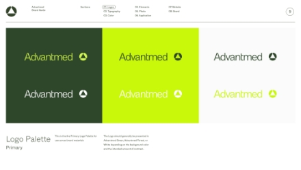
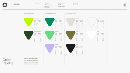
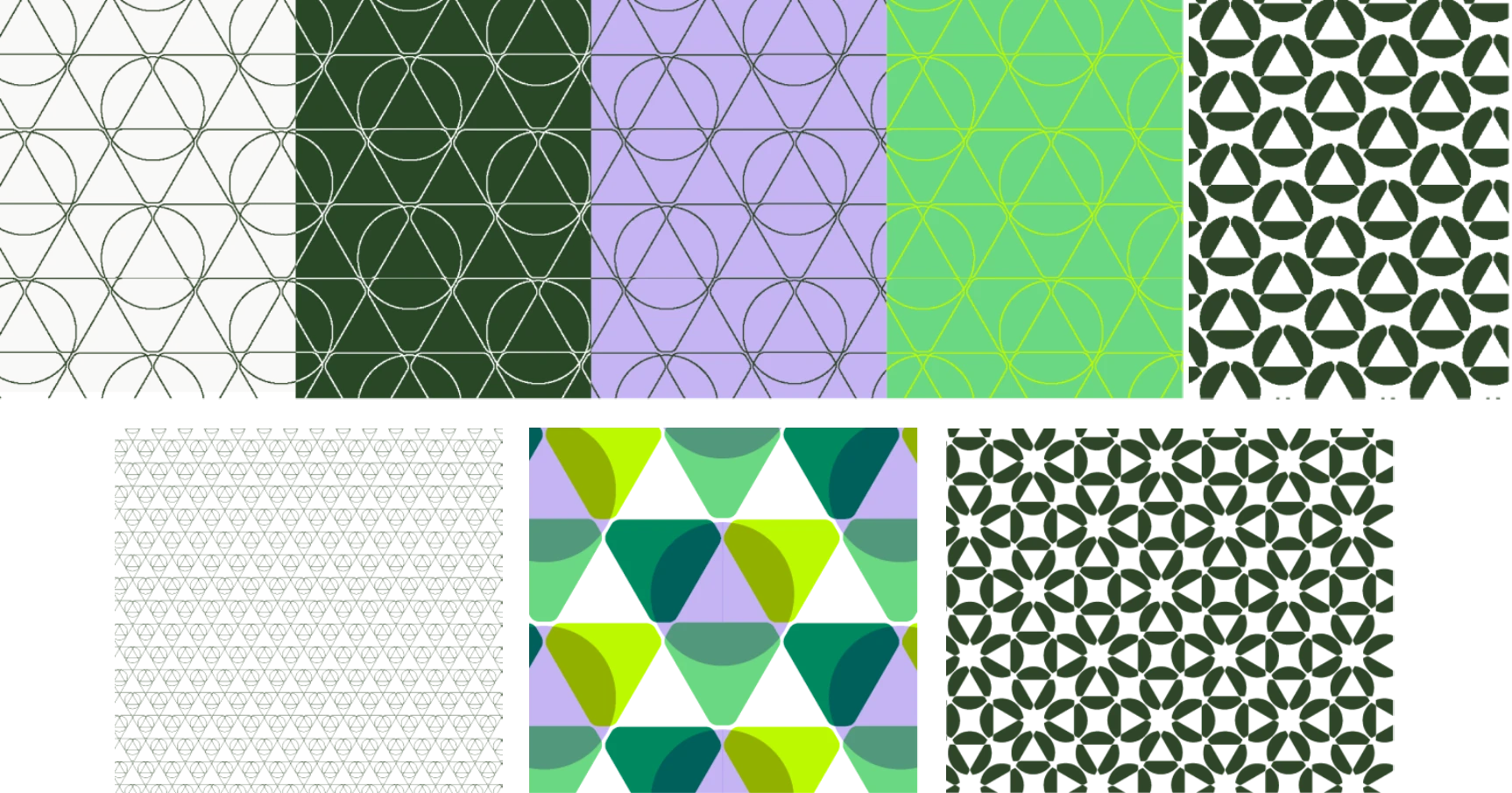
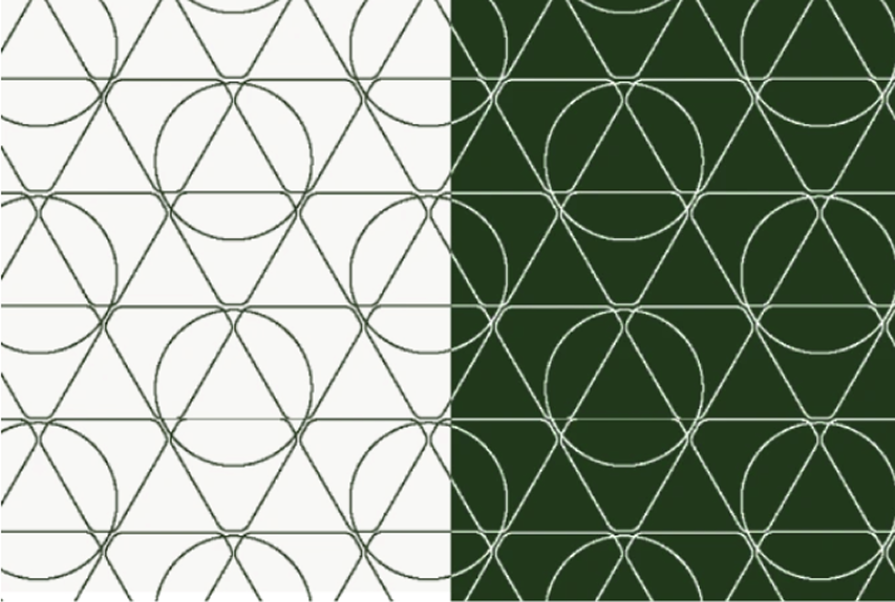
Color palette
Primary Brand Colors

Advantmed Green
HEX:
PMS:
CAF8OC
389C
–
no cmyk
Equivelant

Advantmed Forest
HEX:
PMS:
2F469
553C
d3
–
C:
M:
Y:
K:
78
46
92
50
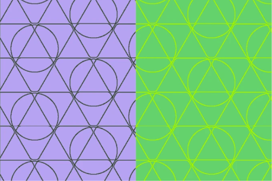
Secondary Brand Colors

Elevate^ Jade
HEX:
PMS:
–
3A8762
7724C
C:
M:
Y:
K:
87
22
78
07

Turquiose
HEX:
PMS:
87D58B
2268C
–
C:
M:
Y:
K:
78
46
92
50

Lavender
HEX:
PMS:
–
C22B6EF
2645C
C:
M:
Y:
K:
22
28
00
00
Neutral Brand Colors

Sand
HEX:
PMS:
–
E4DFDB
9080C
C:
M:
Y:
K:
09
10
11
07

Olive
HEX:
PMS:
–
757343
7749C
C:
M:
Y:
K:
51
41
89
20

Black
HEX:
PMS:
–
1c1c1c
Black6C
C:
M:
Y:
K:
78
46
92
50
Neutral Brand Colors

Fog
HEX:
PMS:
–
f7f7f7
10%-9080c
C:
M:
Y:
K:
02
01
01
00

white
ffffff
000
ffffff
000
C:
M:
Y:
K:
00
00
00
00x
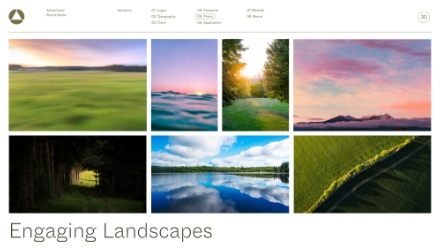
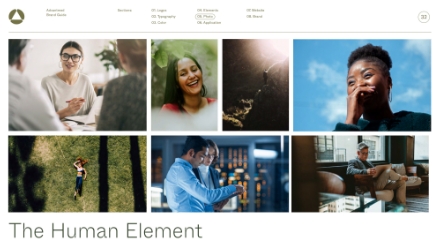
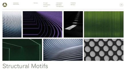
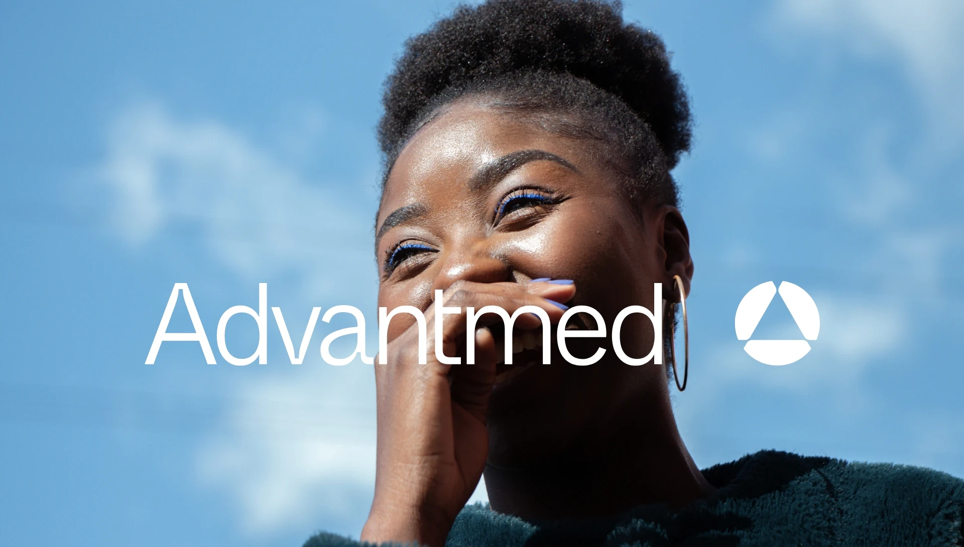
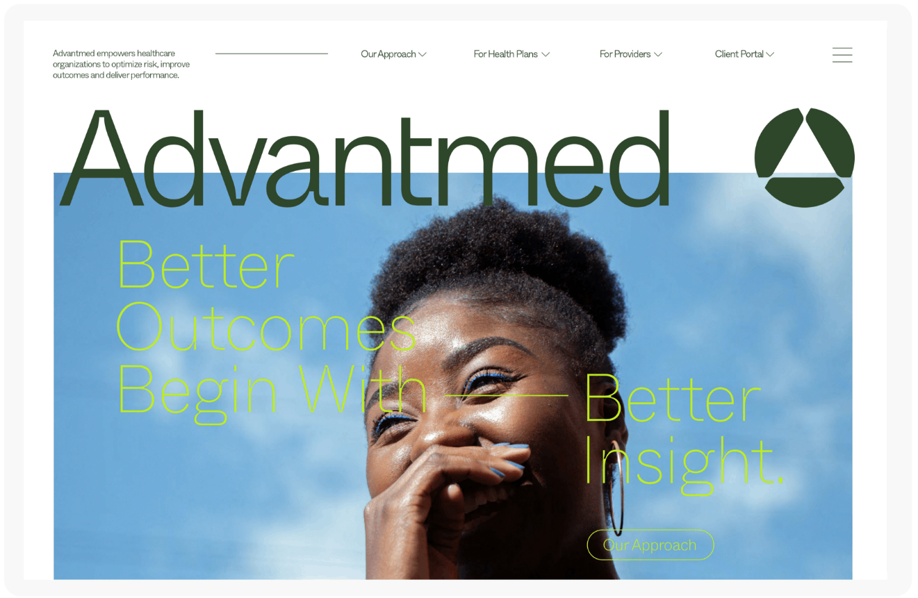
Photos


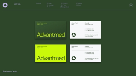
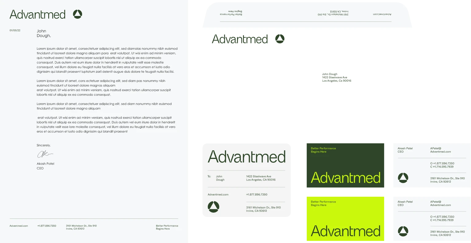
BETTER PERFORMANCE
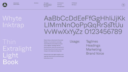
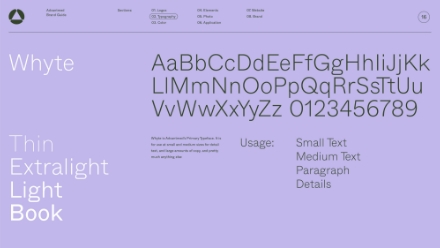
Whyte
Inktrap
AaBbCcDdEeFfGgHhIiJjKkLlMmNnOoPpQqRrSsTtUuVvWwXxYyZz 0123456789
(02)
Business
Immersion
WHAT WE DID
naming
marketing materials
client / market research
presentations
mission, vision, values
social branding
positioning / messaging
website design
brand strategy
location photography
content development
explainer video
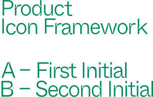
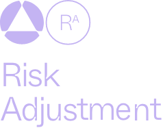
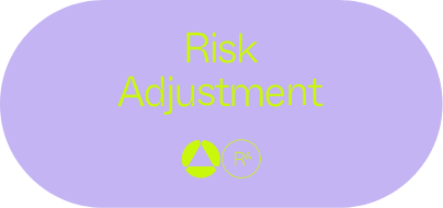
Icon set


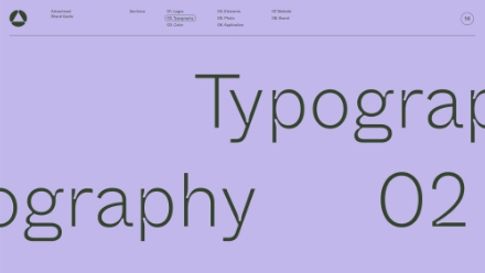
Typographic
Hierarchy
Thin
Extralight
Light
Book
Whyte Inktrap is Advantmed’s Personality Typeface. It is primarily for use at large sizes for Brand communication purposes such as Taglines, Headings, Banners, Advertisements, where the nuanced cuts in the type bring a future forward nuance and intrigue to the statements being made.
Primarily stick to the lighter weights so the large type doesnt become overwhelming by being heavy as well.
Usage:
Taglines
Headings
Marketing
Brand Voice
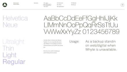
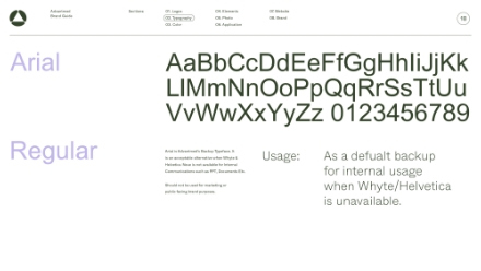
Helvetica
Neue
AaBbCcDdEeFfGgHhIiJjKkLlMmNnOoPpQqRrSsTtUuVvWwXxYyZz 0123456789
Ultralight
Thin
Light
Regular
Helvetica Neue is Advantmed’s Backup Typeface. It is an acceptable alternative when Whyte is not available for internal Communications such as PPT, Documents Etc.
Should not be used for marketing or public facing brand purposes.
Usage:
As a backup standin on web/digital when Whyte is un available
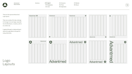
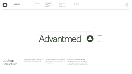
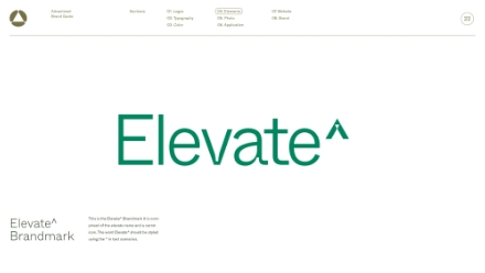
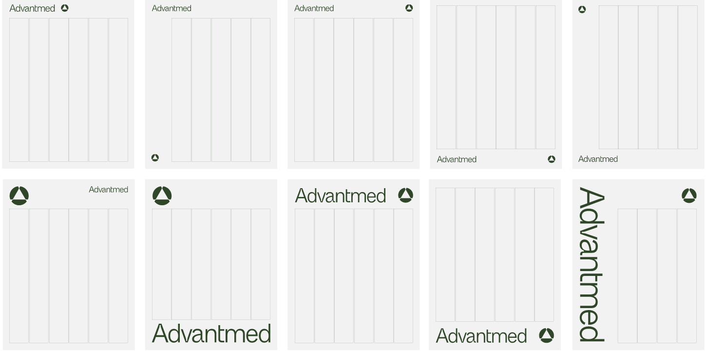
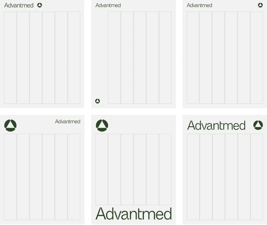
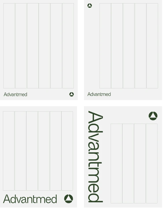
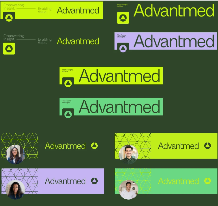
Logo Layouts
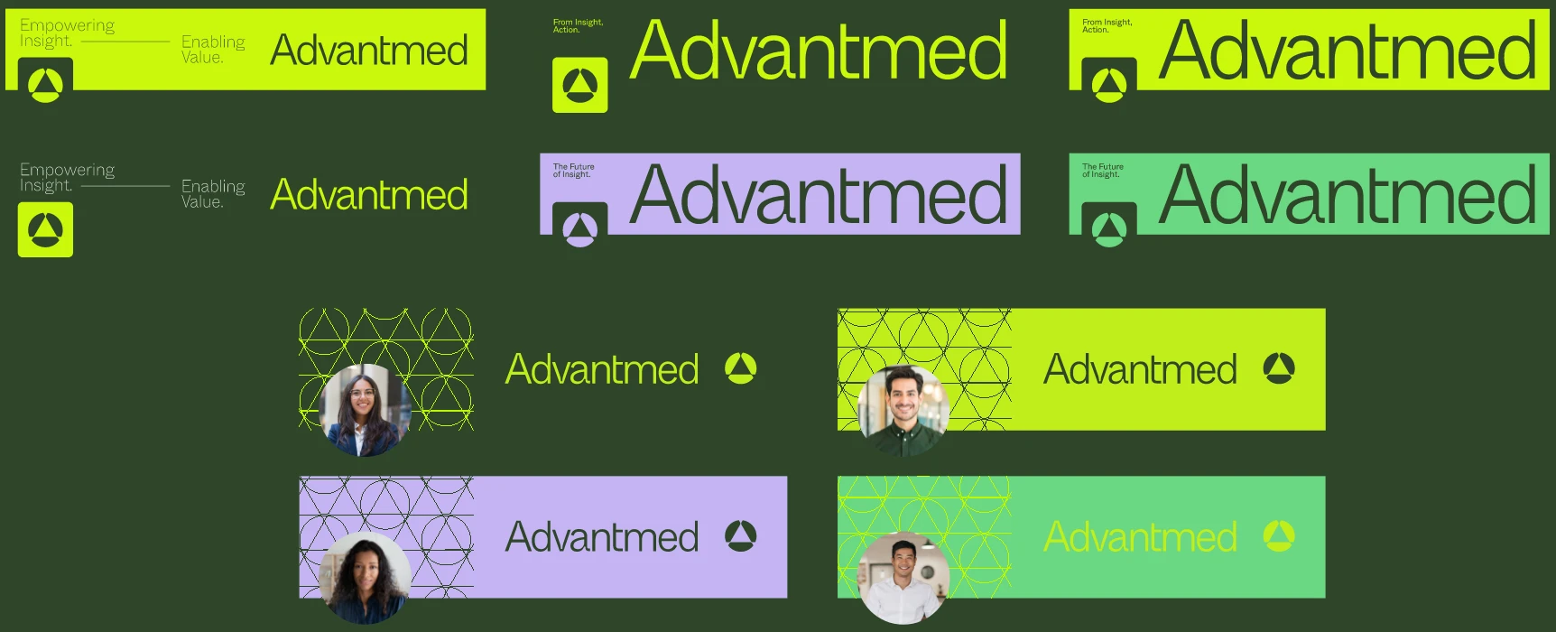
LinkedIn Layouts


Brand
Guide